Error messages are so often given little thought when re-launching a website but actually they could be one of your most visited pages. It’s worth spending some time on them to get them right. Turn them into positive pages by making them sound like they were written by a person rather than automatically generated and making them useful, maybe even fun. Here are some examples of 404 (page not found) errors from big charities and companies.
404 – computer says no
No branding, robotic language (‘the requested resource has not been found’), assumption that it is the user’s fault (‘please ensure you have typed the address correctly’), no alternative links, this is a desperate, desperate place to find yourself. This charity’s error page could have been marginally worse if the heading had been in red.
A confusing error is sometimes worse. This example says error three times and gives a code which is meaningless to the user. We don’t know whether we are seeing this as a result of a technical problem or a broken link? To ‘go back’ is the only option given.
Be helpful and approachable
WaterAid make it very clear what has happened (‘file or page not found’) and what they want you to do (email).

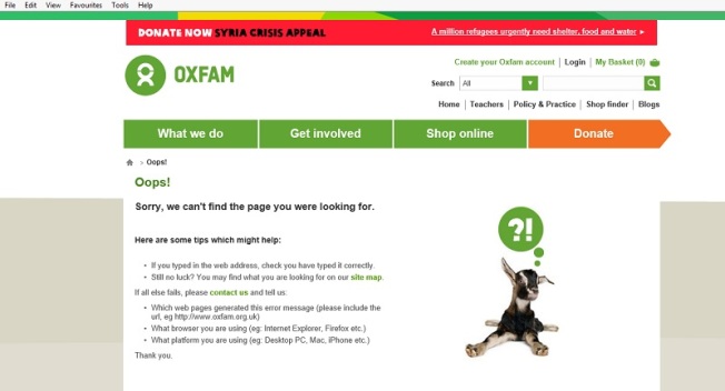
Oxfam’s 404 works through some solutions (‘here are some tips which might help’) alongside a confused goat.
The British Heart Foundation’s 404 starts with a sorry, has a please and lots of ideas for alternative destinations (presumably based on the most common interactions).
Connect with your cause
RNLI’s error message connects the error to their strengths. They have a picture of a man looking through binoculars and text which says: ‘We’re sorry – we can’t seem to find the page you’re looking for. That’s a shame, as we’re usually quite good at navigation.’ Nice.
Missing People’s 404 does something similar: ‘Page not found, neither is Thi Nguyen’ then full details about the missing person.
Add personality
Dog’s Trust have bags of personality online (see their brilliant fetch (rather than search) button). DT’s 404 page has a cute dog, friendly heading (‘Oops – this page isn’t here’) and a pointer to the site map and other links. Their technical fault is even better.
Of course, animal charities have more potential to add personality / fun / cute pictures than say a health charity. Blue Cross say ‘Oooooops’ and have a snoozing cat. RSPCA say ‘Whoops’ and ‘Looks like a dog may have run off with that page. Sorry about that. Perhaps he’s buried the page out the back?’
A nice picture is a good way of brightening up an error page, even better if it’s of something relevant. Here, the BBC’s 404 page has gone retro with our old friend the clown dusted down from the 70s, now with 404 written on the chalk board – genius.
Lego’s 404 is just weird.
How do you match up?
Go check your error pages:
- are they helpful?
- do they generate a positive reaction?
- could you add an image?
- is the language clear and approachable?
- are there clear links to get people back on track?
Think about what you can do to improve your user experience. Reward people for finding this ‘secret’ page rather than punishing them with an unhelpful, dull page.
While you’re there, check errors in forms. Are you nicely hand-holding to help people complete a purchase, enquiry or donation or SHOUTING AT THEM for making a mistake? (See previous post on donate forms for some examples.)
Want more?
If you need more inspiration for dull vs fun error messages, just do a search for 404 in google images or look at Wikipedia’s page on 404.
Comments?
I looked at hundreds of charity error pages in the interests of research and these were the most inspiring I found. Please do share your tips and favourite examples (good and bad). Leave a comment, go on.


