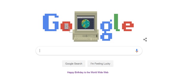
The World Wide Web is 30 today (11 March 2019). Five years ago I used the Wayback Machine to look at trends in charity website design, using British Red Cross as an example. Here is the post, now updated with lessons from 2019.
Is your charity website keeping up with the latest developments in design and functionality?
Starting out – 1998
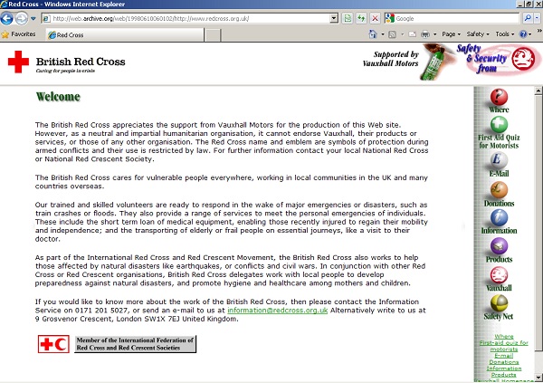
The British Red Cross homepage in 1998 shows that the web standard of logo in top-left was there from the start. The site was very basic, probably hand-coded in html and uploaded via FTP.
- Brochure-ware content – dense homepage to be read like a book.
- Email to make a donation.
- ‘Click here’ links.
- No images.
- No search.
- Approx 10 pages. Only one-level down.
- Sponsored by Vauxhall.
Increased functionality – 2006
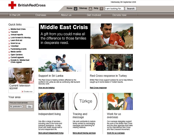
Fast-forward eight years and the 2006 homepage leads with an appeal. Fundraising and raising awareness is now most important. There is greater awareness of design. More thought about actions and audience.
- Published using CMS.
- Images but no coherent design.
- Site-wide (top) and left-hand navigation.
- Fundraising prominent – 6/12 ‘Quick Links’ are fundraising. Donate now tab.
- Search button.
- Functionality – ‘In my area’.
- Accessible links.
- No social media (Facebook launched in 2004, Twitter in 2006).
Integrated digital comms – 2014
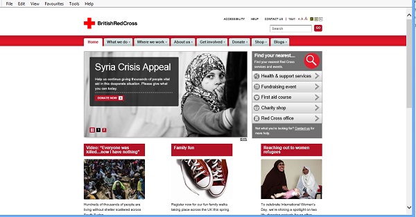
Another eight years and now the 2014 website still leads with an appeal using a single emotive image. The site is sophisticated offering many opportunities for interaction, transaction, discussion and commerce but also has a presence across many other digital platforms (YouTube, Facebook, Twitter, blog, Apps, games etc). It feels like digital is now being taken more seriously.
- Multiple channels (links to six network channels at the bottom of the page).
- Optimised for mobile / tablet.
- Many opportunities for interaction.
- Greater use of video, audio, photos, games to tell a story.
- Donation button and quick PayPal option on homepage.
- CMS powered, integration with CRM and other databases.
- Evolution of ‘in your area’ functionality.
- Accessibility buttons.
Website in 2019
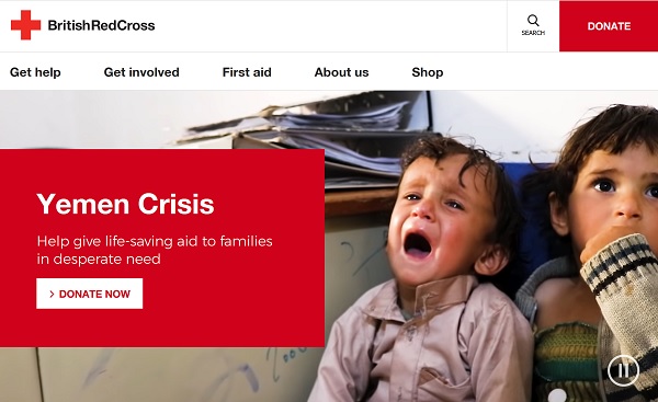
Now the 2019 homepage is all about clarity and impact. Previously the homepage would have had to work hard at promoting everything as most people would go to the homepage first. Now sites are so well indexed with people going direct to the pages they are looking for, so the homepage can be devoted to telling a story or running a campaign. The homepage can appeal to hearts and minds rather than acting as a directory.
The currently site uses a full-screen video for the current appeal. It shows 10 seconds of different views from Yemen to tell a story to drive donations.
Below the appeal, the page is segmented into sections with different types of links (UK appeals, get help in a crisis, support, first aid, how we help, shop). These use colour and photos to make it easy to use. This architecture is replicated in the top-level navigation which is now reduced to five options.
- Images are more powerful, instantly telling a story. Video is centre-stage.
- Simplified navigation (no more What we do, Where we work etc).
- Language is shorter and has more impact. Links are 1-3 words. Appeal text is ‘Help give life-saving aid to families in desperate need’. In contrast with ‘Help us continue giving thousands of people vital aid in this desperate situation. Please give what you can today’ from 2014.
- Donate button on top right-hand side.
Web design in 2019
I have been training people on writing for the web since 2003 – over half of the web’s life – and working on websites since 1996. Many of the old rules still apply (short sentences, headings, meaningful link text etc). But the way we consume information and content online in 2019 means that we now need to be even tighter with our words. Attention spans are shorter and screens are smaller. The language we use needs to be immediate, strong and clear. There is no room for wasteful words on the homepage or in navigation links.
Photographs and images now need to have more impact. They should use strong colours and instantly tell a story. Compare the images used in 2006 / 2014 with the images used now. They use close-ups and are not afraid of sharing an intimate moment, pain or emotion. They are beautiful and difficult to look at.
Homepages generally use a hero image (or in some cases video) which is shown at full-screen. This image has to work very hard to communicate everything you want in that key real estate location. Do you have images that are strong enough to do that? Take a look at the homepages of Crisis, NCT, Brathay Trust, and Bloodwise for examples. (See also Review and improve your use of images.)
Your digital strategy
You don’t need to be the size of British Red Cross to need a clear plan for how your website and wider digital platforms support the goals of your organisation. Technologies and design standards are changing all the time. Just today, Samaritans launched its new website which has a cool features such as a dynamic homepage which changes depending on the time of day.
A digital strategy can help you to persuade trustees to invest in new technology or staff. You may use it to plan your increasing use of social media, create digital services and have a reference for how you’ll deal with a crisis. Or it may help you plan the next 6-12 months, ensuring you are using your resources in the right way and keeping up with your peers.
Take a look at the Charity Digital Code of Practice which was launched at the end of 2018. It where charities are at with Code.
Whatever the priorities for your website, it is worth investing your time in producing a digital strategy to support its future evolution.
Useful links
- Charity Digital Code of Practice
- The Charity Digital Toolkit
- Charity Comms posts on digital strategy
- Charity Comms’ Digital benchmark
- Building a digital workforce – NCVO tool.
- CAST’s 10 design principles for better digital design.
If you need in-person help, there are lots of Digital Strategy courses and freelancers / consultants who can support you.
More on the web at 30
Read more about the web at 30:
- 30 years, what’s next for the web from the World Wide Web Foundation
- crowdsourced timeline of web milestones
- We can get the web we want – Tim Berners-Lee in The Guardian.
Look at other examples of how design has evolved via the web design museum.