Nonprofit digital advent calendars – tips and examples

Digital advent calendars can be a great way to drive engagement during December. If you have 24 pieces of content, why not package them up? You don’t have to produce a slick clickable website, an image shared on social media is perfect.

Think about how to use your existing digital assets and a theme to give your followers a treat every day. It’s been a hard year and we all need cheering up.

Examples from WCHP, MS Society, Royal Marsden, New Mills Food Bank, Bliss, Bookstart, Family Holiday Association

If you are thinking about doing an online advent calendar, here are some questions you should ask.

Does an advent calendar fit with your brand?

How will your supporters respond to a daily offering? Do you get much interaction from your every-day communications? Look at your stats and find out what type of content works best. A daily treat could inspire interaction if there hasn’t been any or could attract new audiences. Or it could annoy people if you pitch it wrong.

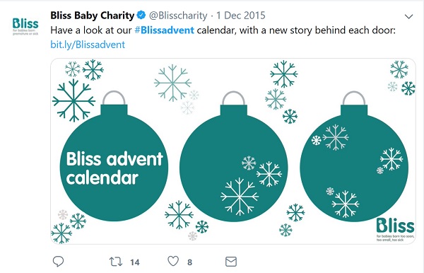
Is an advent calendar too flippant for your cause? This depends to some extent on your tone of voice. If you have a serious cause, it is possible. For example Bliss shared stories via a calendar on their website and via #blissadvent on Twitter).

screenshot of Bliss' 1st day of their calendar.

Can you sustain it?

24 days is a really long time to do one thing.

How can you maintain momentum over 24 days? Avoid a slump in the middle by planning your content carefully. What existing content could you use and what would you need to produce from scratch? Can you link in with other big days in December?

Do you have the resources to publish and respond to comments over a whole month including weekends and into the holidays? You can schedule posts via publishing tools such as Hootsuite but will need to keep an eye on responses.

If you don’t the energy or resources to cover 24 days, you could scale down to use the 12 days of Christmas instead? See this from the Imperial War Museum. Or use the quiet days between Boxing Day and New Years Day to run your own campaign maybe sharing your impact or highlights from the year?

Should you have a theme or goal?

It can be useful to have a theme to focus your activities. Themes nonprofits have used include:

  • inspirational quotes, images, stories
  • thank you’s to supporters
  • competitions and special offers
  • fundraising stories and tips
  • successes over the year
  • awareness raising / messages / campaigns.

Think about what will be interesting to your supporters.

Museums, galleries and cultural organisations in particular make good use of digital advent calendars to share gems from their collections. Take a look at the Horniman Museum’s calendar on instagram or National Library of Scotland’s #cartogradvent.

Some council’s are doing calendars too. This comms2point0 post from Merton Council explains how they are using their collection.

How technical should you go?

A simple approach is to just share an image on each new day via social media. This method works well if you are an organisation who has beautiful or inspiring images or a collection to showcase. Or have used Canva or equivalent to illustrate quotes.

There have been many more gif-based calendars this year. See this example from Community Christmas.

Video-based calendars and interactive websites are rarer. Even more unusual is the offline calendar. See Folkstone’s Living Advent Calendar.

Top tips

To build traction over the period, include a short specific hashtag such as AbbreviationOfYourOrgNameXmas19, eg #THxmas19 or #BlissAdvent as above. This means people can explore previous days as the month progresses.

Include a link so people can find out more or take an action. If not done, this creates a dead-end. The calendar becomes a nice-to-have thing rather than something which drives traffic or action. People are likely to share these types of images so you have the potential to reach new audiences who might not know about you.

If on Twitter, pin a tweet which explains what you are doing, for example if you have a theme or an ask, so people can find this easily. And use threads to link them all together.

Calendar examples

Get some inspiration for this year. Take a look at my pick of digital advent calendars from previous years:

Your tips

Spotted any good nonprofit advent calendars? Have you run one yourself? Was it worth the effort? Do you have any top tips? I’d love to hear from you.

How to make the new Twitter profile work for your charity

The new Twitter layout brings new opportunities for using images. But the size and shape of images required, especially for the header, is tricky to get right. Should you stretch your logo (er, no), use a generic photo library background or search for a single picture which tells your story? There are still lots of organisations and people who haven’t made the switch yet, let’s look at some who have.

Using the profile for an appeal or campaign

This example from @OxfamGB uses one very powerful image (of a person looking directly at us) alongside a red banner about the appeal and JustText Giving details underneath. As Twitter is not traditionally used for fundraising (see previous post on donating in 140 characters), the header presents a brilliant opportunity. Oxfam could reinforce the header by pinning a tweet about the appeal so it appears at the top of the page. This would drive more traffic as nothing in the profile space is clickable.

Oxfam GB: powerful image of a face to support their South Sudan appeal

Child’s i Foundation are using their profile to promote their latest fundraising campaign. The pinned tweet works well here especially as it uses a different but similar picture.

Child's i Foundation - profile promotes their fundraising campaign. Strong picture.

Alzheimer’s Society are using their header to promote their latest campaign, Don’t bottle it up. They have included their #hashtag and link.

Alzheimer's Society: Don't bottle it up campaign text and image

Other examples organisations using the header for fundraising or to give information:

One strong image

It can be difficult to find one strong image, especially one which tells a story, is easy for everyone to understand and works in the letterbox shape (1500 x 500 pixels).

Mencap use one strong positive image of a man and boy, both smiling. This complements their friendly bio (‘Hi, we are Mencap. Everything we do is about valuing & supporting people with a learning disability, their family and carers’).

Mencap: strong image of boy and man smiling

What does your picture say about you? A photo of a single person works well as a fundraising persuasion tool but this is social media so maybe your image should be a reflection of your inclusion? There are a few examples of this such as this one from Parkinson’s UK and The Muscular Dystrophy Campaign.

Parkinson's UK: big happy group wearing branded t-shirts

Play to your strengths. What images do you have which you know work well? For example Guide Dogs use puppies.

Guide Dogs: three black labrador puppies

Other examples of one strong image:

But what if you don’t have a stock of strong pictures or your cause doesn’t lend itself to a photo? A graphic can work. Refuge here uses a repeated image from their logo. Lighthouse, a suicide prevention charity in Belfast use a google map showing their location. Headway East London use a painting.

Refuge : tiled graphic

Your strong image doesn’t have to be serious, it can be cheeky like Beating Bowel Cancer‘s.

Beating Bowel Cancer: group posing with plastic bottoms

Finally, museums, galleries and heritage organisations have an amazing opportunity to showcase their collections as this example from the Imperial War Museum shows.

IWM - using a painting of WW1

If you are using one strong picture, think about how often you will change it and where else it appears. Will people get tired of it after a while? How many other places it is appearing? It may be useful to use one image across your social media channels and change them to something else all at the same time. Or have one strong image per channel and use this permanently.

Checklist

  • Check that your header image works well at 1500×500 pixels. Does it tell a story? Is it cropped in the right way and uncluttered?
  • Make sure that the image and / or text is not blurry or pixelated. Start with a big picture and reduce. You can’t make small pictures bigger – you’ll lose definition.
  • Check that your logo / profile photo doesn’t obscure anything important in the header. (For example in the Guide Dogs example above, the logo slightly obscures a puppy’s nose.)
  • Is your logo / avatar clear at 400 x 400? Does it still work when reduced to tweet size?
  • Check how your image appears using different browsers / devices etc. You don’t want to do a Good Morning Britain. Images can look subtly different but enough to stop them making sense / working as well. For example, look at Samaritans’ profile – in the web version, the woman’s eyes are oddly cropped out but in a list of profiles, they appear!

Samaritan's - image cropped too close

List view - Samaritans picture is bigger revealing the woman's face

Useful links

Share your favourite examples

What examples have you come across which have inspired you (in a good or bad way?) What have you learnt about using the new-look Twitter? Please share your comments here.

Can I help you?

Please also get in touch if you’d like me to help you with social media. I am a freelance web editor and trainer and can help give your digital communications a healthcheck and ideas injection.